Plain Text Abandoned Cart Emails? What the Data Says
I recently revisited a client's abandoned-cart flow with one purpose: measure how timing and message style change recovery. A controlled split test produced numbers worth sharing, and the takeaways below can plug directly into your own sequence.
Timing that matches a shopper’s own routine; tldr
The only quick point I want to make here is to hit the cart abandoner with their second or third touch 24 hours after they were shopping, not 24 hours after their first touch in the flow.
What I have found works well
Hit them for the first time between 30 minutes and 2 hours after they abandon the cart. Then, hit them with an incentive offer (% discount, $ off, etc.) 22ish hours after the first email, so they receive it at the same time of day they were browsing the site the day before.
People have routines, and you increase your likelihood of catching them with a free moment if you hit them at your best guess of when they are available.
Those two touches, properly spaced, recover a meaningful slice of revenue. Subsequent follow-ups are necessary (and some businesses may want an additional touch between those two), but in my experience, the vast majority of the recovered revenue comes from the series of messages that hit their email/SMS notifications within 24 hours of their initial shopping.
Plain text vs. designed email
We previously used a fully designed template that matched brand colors and displayed each abandoned item. But what if we tried a simple, plain-text touch instead? The exact opposite of what we've been doing.
Half the audience kept seeing that polished version, while the other half received a concise plain-text note. Subject line and send time were identical; body style was the only variable.
Klaviyo screenshots:
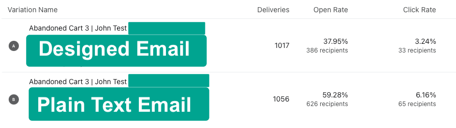
Designed email: 37.95% opens | 3.24% clicks
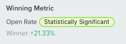
Plain-text email: 59.28% opens | 6.16% clicks
The significant open lift of plain-text can only come from inbox placement, because subject and timing matched. Gmail is almost certainly slotting the plain-text variant into the Primary tab more often. Click-through nearly doubled because the body is streamlined: one sentence explaining why the email arrived, one sentence outlining the offer, and a single dynamic cart link. No competing buttons, no social icons means one clear action. It's easy to read at a quick glance. No distractions.
Why I bet on plain text in the first place
Earlier this year I ran a separate series of promos where half the list received a full-design announcement and the other half received a short plain-text note. Subject lines and send times matched, yet the plain-text promos pulled higher opens and higher click-through every time. That result nudged me to question whether design was helping or quietly hurting our abandoned-cart sequence. The new A / B test confirms the pattern: when the email looks like it came from a person, more shoppers open, skim, and click.
Should we ditch designed emails altogether?
Short answer: no. Visual branding still carries weight, especially for product launches, look-books, and seasonal campaigns where imagery does the selling. The real takeaway is that plain text is under-utilized. Use it for key lifecycle touches such as abandoned-cart nudges, site-wide sale announcements, and win-back initiatives. Let your designed blocks shine where photos and polished layout are needed to convey the email's purpose. Work both styles into your calendar, measure each touch by revenue per send, and share the numbers so we can all sharpen our mixes.
Share your numbers
Have timing or plain-text data of your own? Drop screenshots and metrics here so we can build a broader benchmark.
Talk soon,
John Sciacchitano
Ecom Heads: Scale or Die Trying
Connect w/ Me on LinkedIn